 |
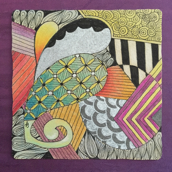
| I finished the Renaissance tile, but now very little of the original tile colour peeks through...... Note to self: Less is more. |
 |
| Rosewood monotangle for Joey's challenge. |
 |
| Tri-Bee monotangle of its many variations. I didn't add shading to this tile cause it was getting too busy. Tri-Bee is a very fun pattern, though. |
 |
| And a last tile in just black and white. Want to see more of my Zentangle tiles? Click here to see my previous post. |
Gorgeous work! I particularly love your Diva piece. I can't stop looking at it.
ReplyDeleteGreat work. I also like the the diva piece!
ReplyDeleteAll your tiles are lovely! Great work!
ReplyDeleteI like all, but the last one is my favorite.
ReplyDeleteAll are wonderful! Especially I like the last one!
ReplyDeleteFabulous ideas here and that Tri bee one looks very modern art, almost Picasso - ish.
ReplyDeleteThese are all lovely! Thanks for sharing your Rosewood Monotangle!
ReplyDeleteGosh, you have been busy. I particularly like the way you have split Rosewood and made it slot into the other one.
ReplyDelete